Team
Jackie Liu (Product Designer)
Akshay R (PM + Engineer)
Justin W (Software Engineer)
Tools
Figma, Github, Userleap
Timeline
Eight weeks, Summer 2021
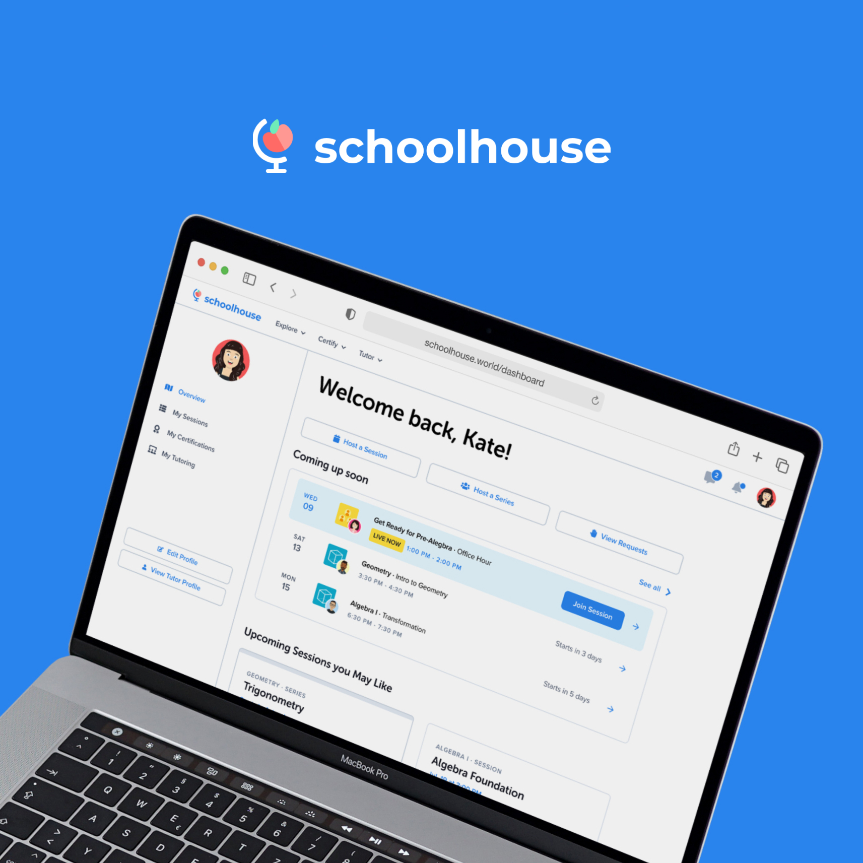
Brief
I was given the task to redesign the user profile page which later turned into the user dashboard.
Problem
Through user research, we discovered the problems of low discoverability, inconsistency, and inefficiency. The flow was confusing and difficult to navigate. There isn’t a centralized place for users to manage their learning on Schoolhouse.
Goals
1. Improve site infrastructure to simplify user flows and make key functions more accessible
2. Personalize learning and tutoring experience
3. Increase session attendance rate, user retention, and engagement
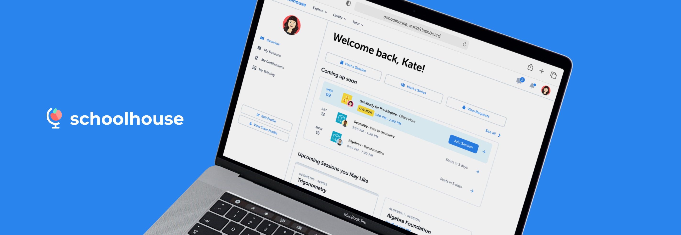
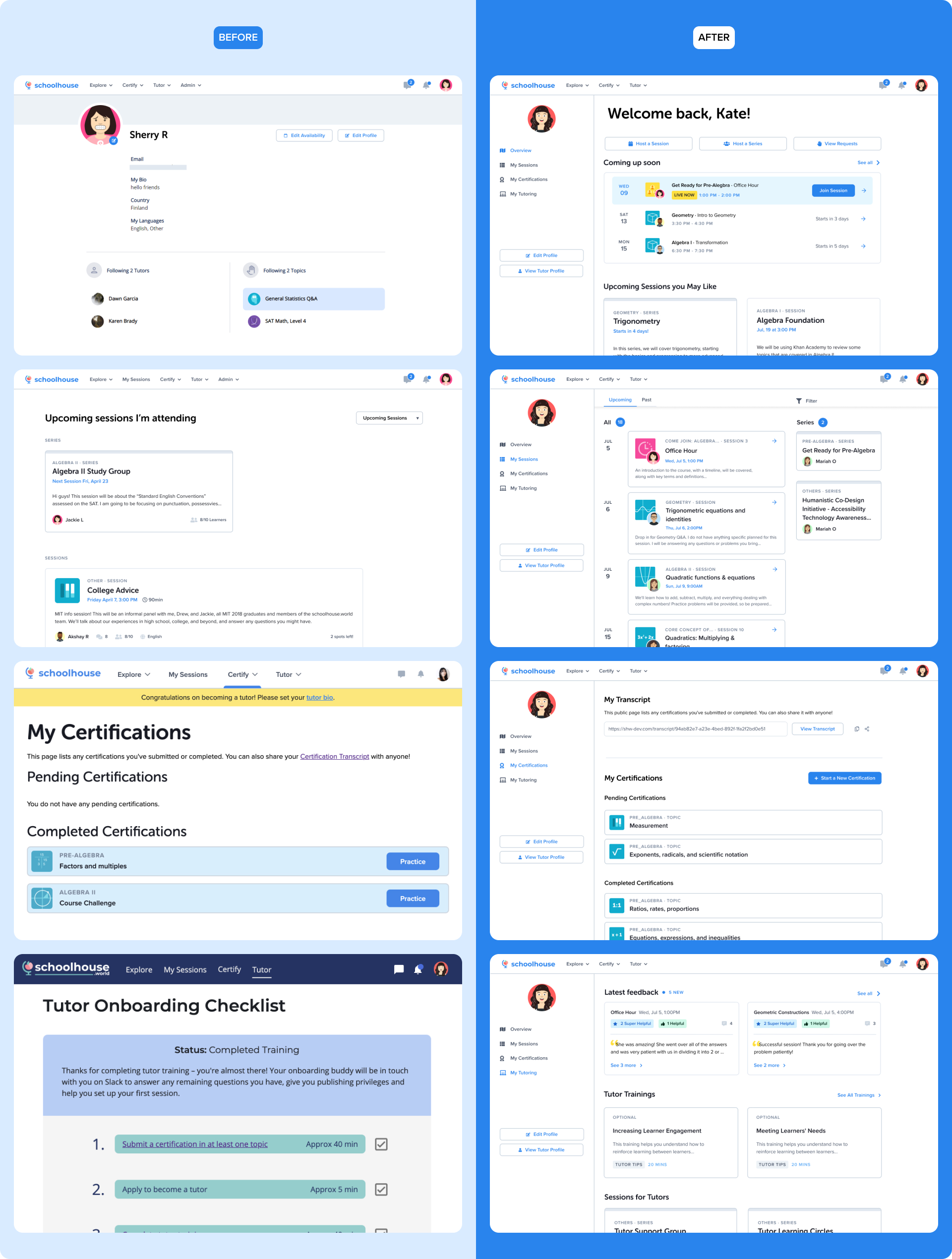
Before getting into my design process, here's a direct comparison of the redesign: a centralized dashboard that includes everything users need to keep track of their learning and tutoring.
Research
I first sent out two separate surveys on the platform to tutors and learners to understand what’s important to them. I received 184 survey responses and conducted five user interviews.
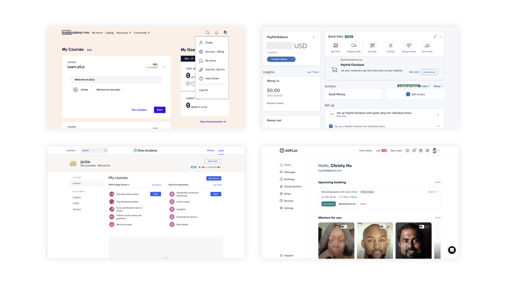
Competitive Analysis
I researched some competitors’ dashboards to find inspiration. What I took away were
1. Using modular blocks to present pieces of information on the homepage can best utilize the space
2. Having a left menu helps with navigating through different information
3. Grouping quick links in one place and using icons to prioritize them
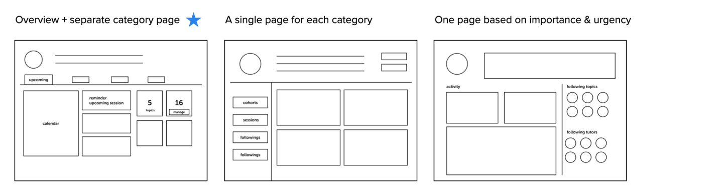
Ideation
Base on my research, I found both learners and tutors rarely use "my profile" because they don’t find it helpful. In response, I brainstormed what are some relevant information to enhance this page. Specifically for tutors’ resources, I have categorized the available resources into tutor training, feedback, certifications, resourses, and session requests.
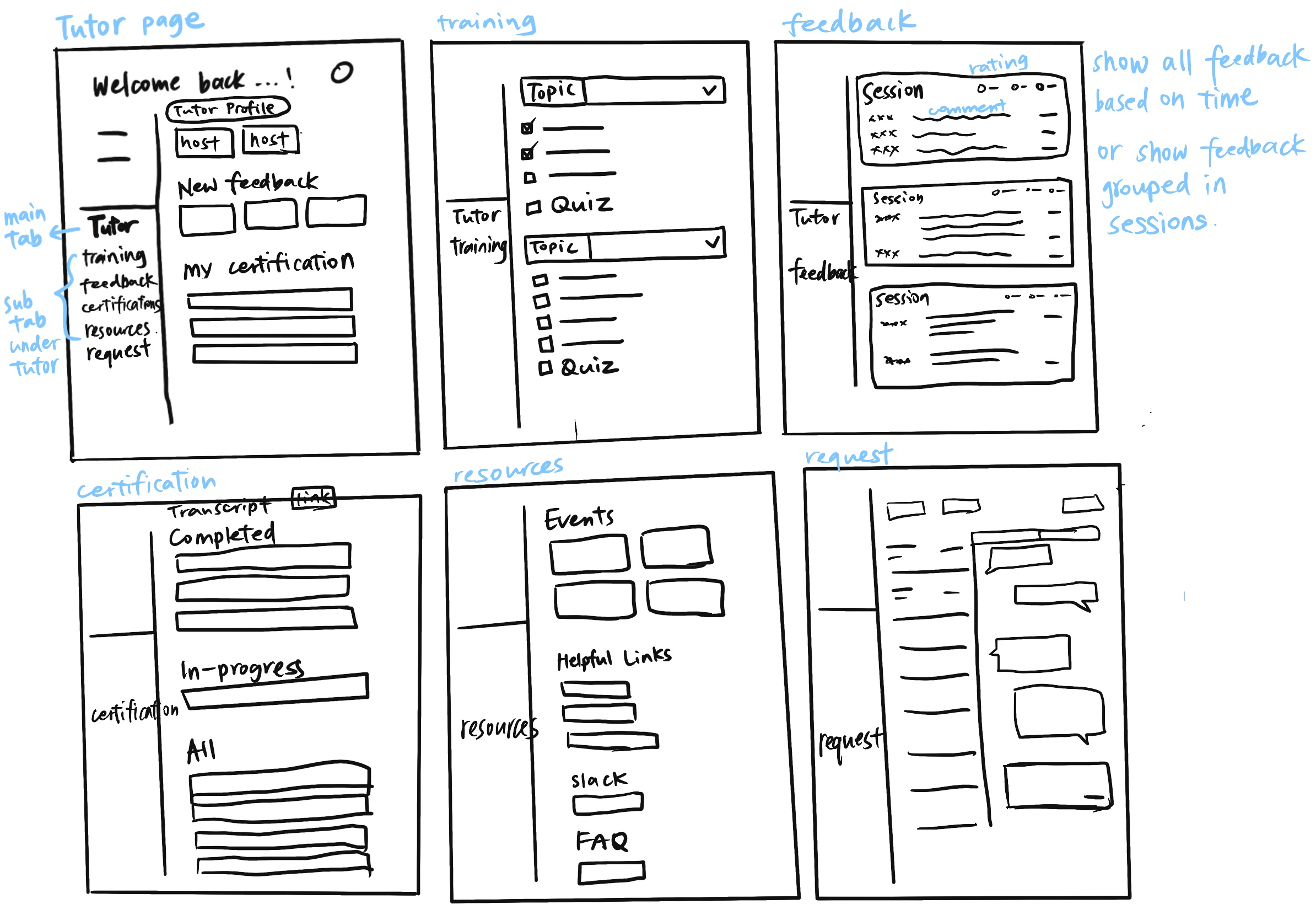
I spent a lot of time looking for a most efficient way to display information on the dashboard, the first page users see after logging in. To determine the most important information that should be displayed on this page, I collaborated with the team and solicited user research and their input on users’ priorities.
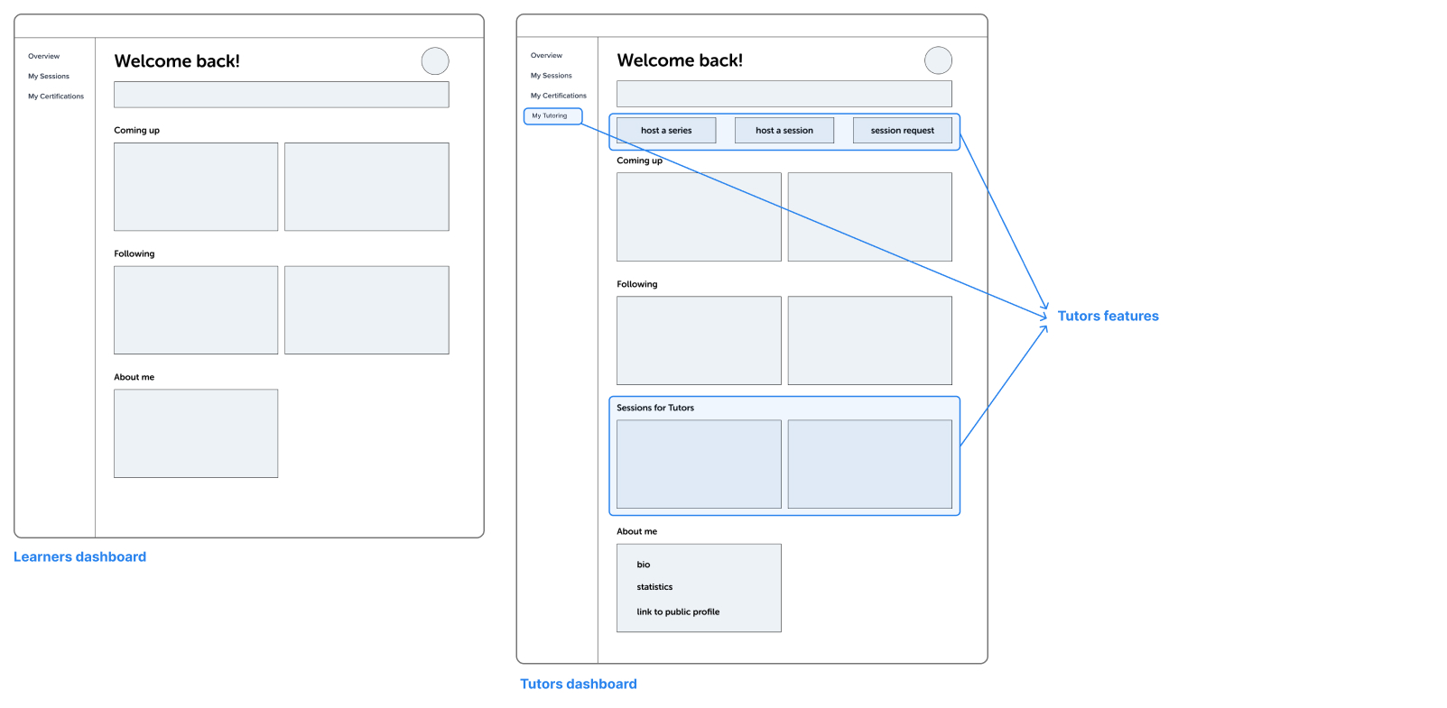
To streamline the engineering efforts and improve the dashboard’s usability, I ensured that the design was consistent for both tutors and learners. While the learners’ dashboard served as the foundation, I added extra features and content to the tutor side to enhance their experience.
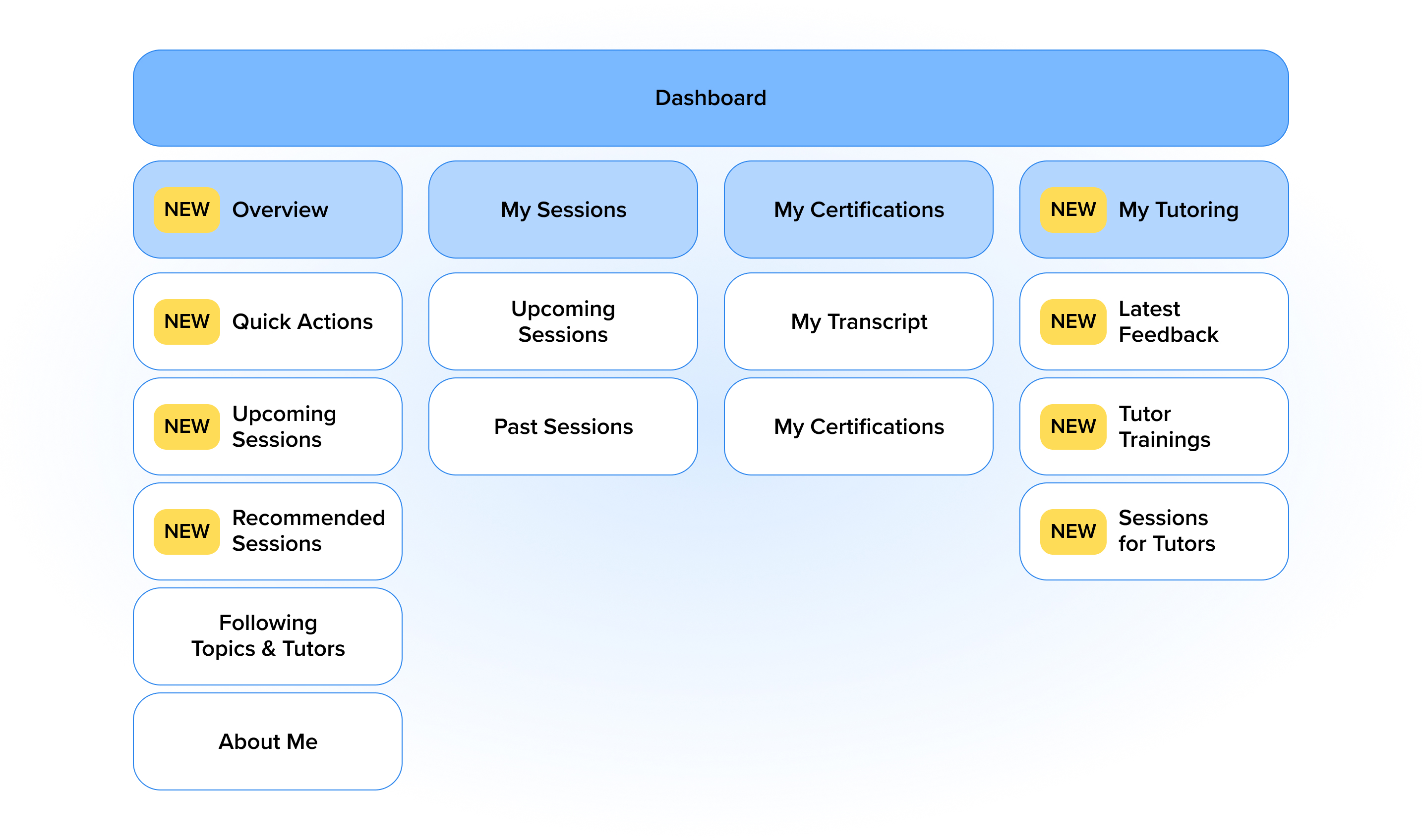
This site map shows the structure of the redesigned dashboard. I divided it into four sub pages: Overview, My sessions, My Certifications, and My Tutoring(for tutors only). I reorganized and structured most of the content and designed new features , which are highlighted in the yellow boxes.
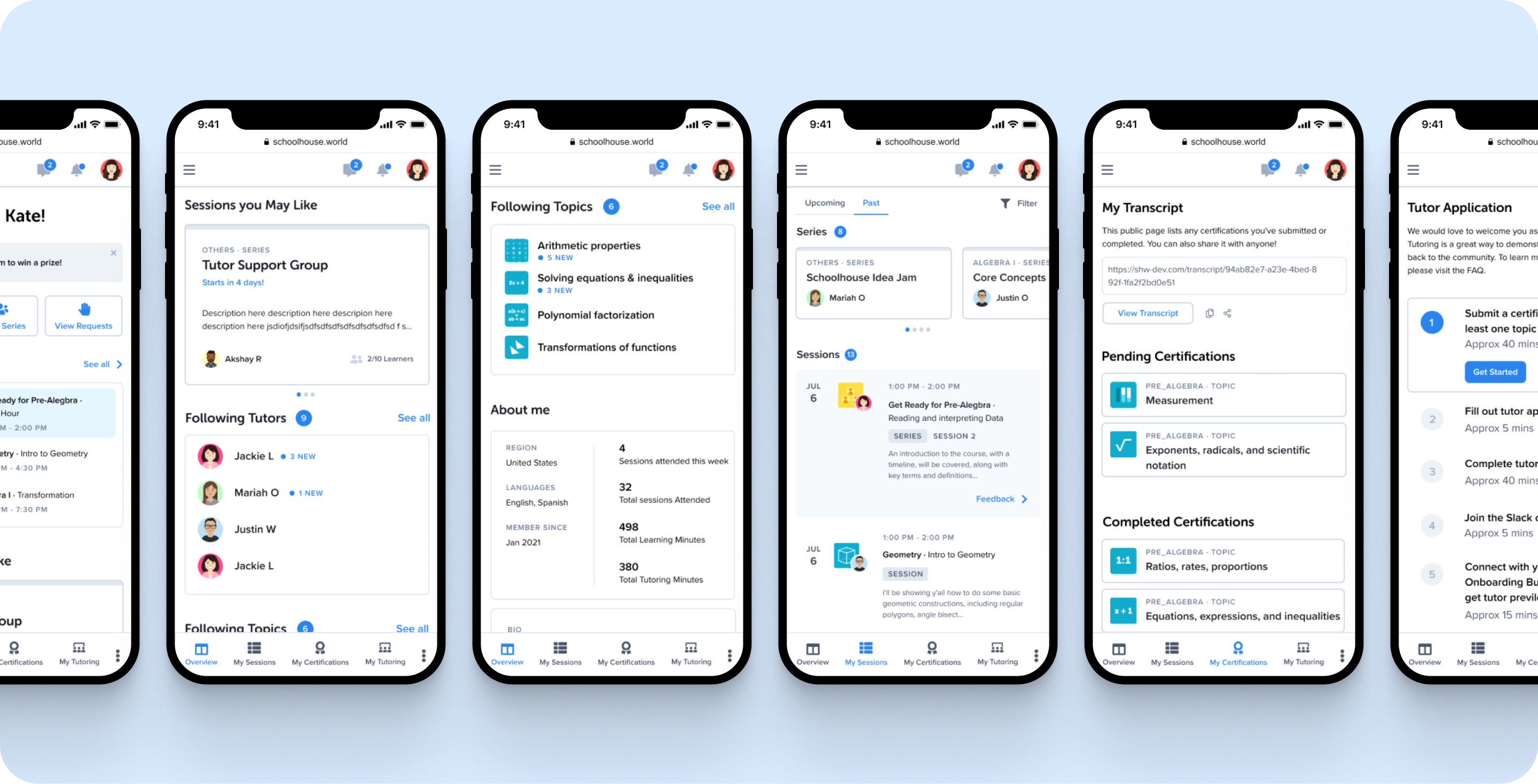
Prototype
Dashboard becomes the first page users land on after they log in. They can easily navigate between four sub-pages in the dashboard to find what they need. This new dashboard is highly received and loved by our users.

User Testing
I developed a click-through prototype on Figma to conduct usability tests to get an in-depth understanding of how users interact with the new interface. I did 40 tests in total over two weeks with existing users (both tutors and learners.) I mapped out a user testing plan, designed several tasks in the prototype, observed users completing the tasks through screen sharing on zoom, and asked for feedback at the end. I received good and surprising reactions and also some areas of improvement which I later implements into the final design. I really enjoyed talking to users, showing them the new design, and seeing their reactions. It motivates me to make thoughtful design decisions that benefit my users.
Next Steps
1. Improve responsiveness on mobile and tablet
2. Design empty states to be more intriguing
3. Implement further customizations
Reflection
I’m proud to work on such a large-scale project from the very beginning. Thanks a lot to my team for believing in me and supporting me throughout the process. I learned to collaborate with engineers and hand off final deliverables. I challenged myself to think of a lot of iterations, present them to my manager, and test them with users. I took advantage of our volunteer community to ask for feedback proactively. I’m glad to see the dashboard was launched at the end of my internship. If there was one thing I could’ve done to improve is to onboard existing and new users to the NEW dashboard better. If I have more time, I would continue to gather user feedback and make improvements on v2.
Check out similar projects that may interest you