Team
Yining Qian
Tools
Adobe XD, Illustrator
Timeline
48 hours; April 3 - 5, 2020
Brief
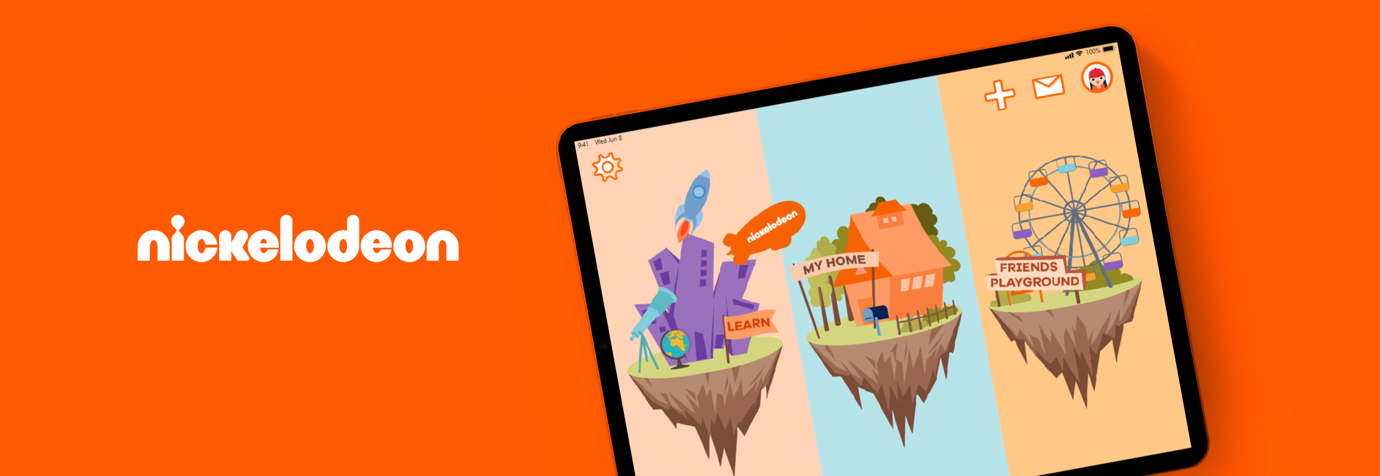
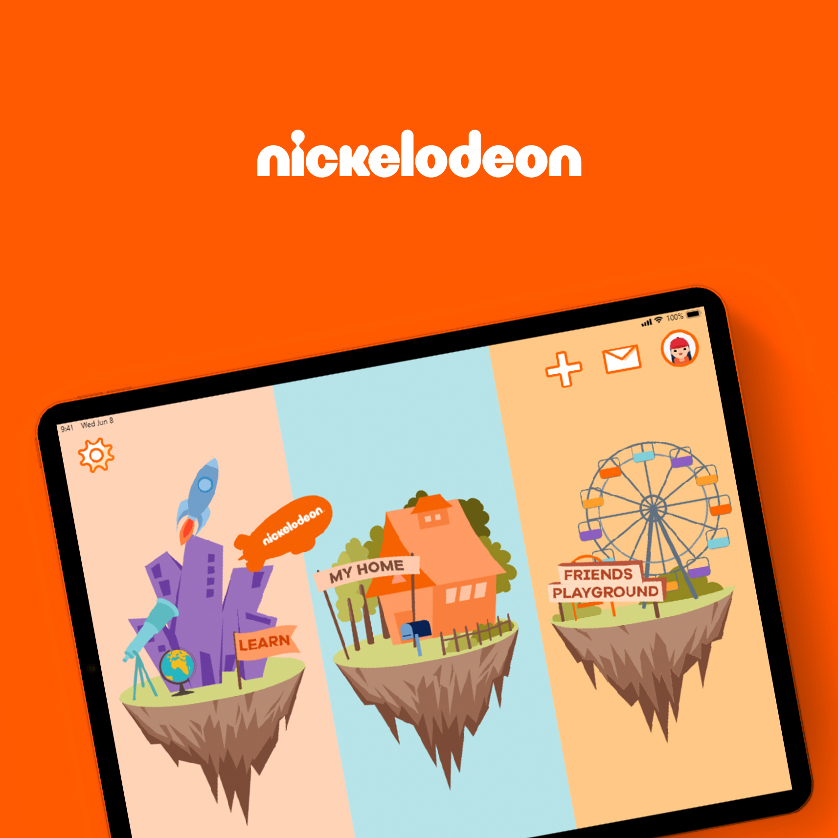
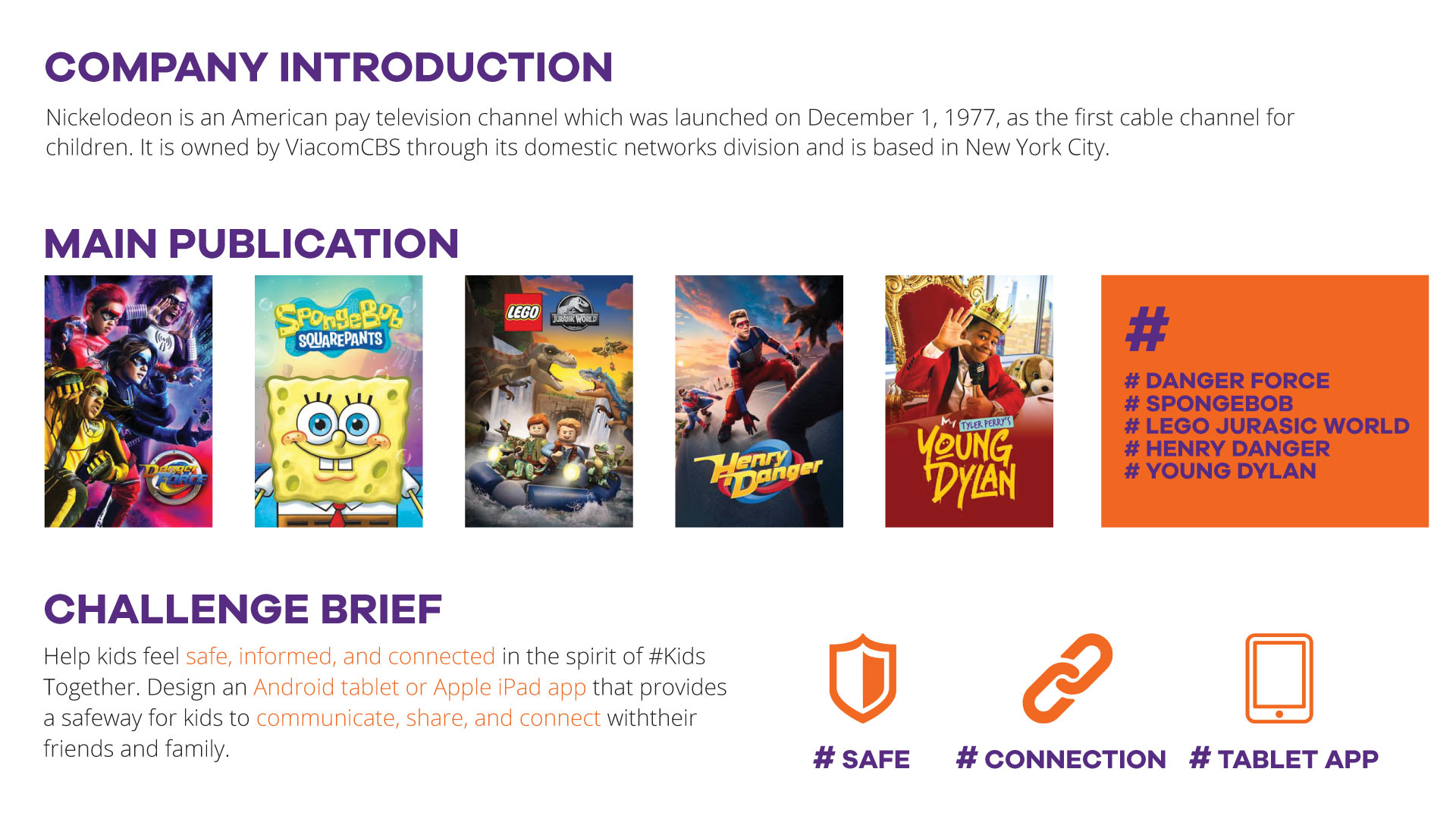
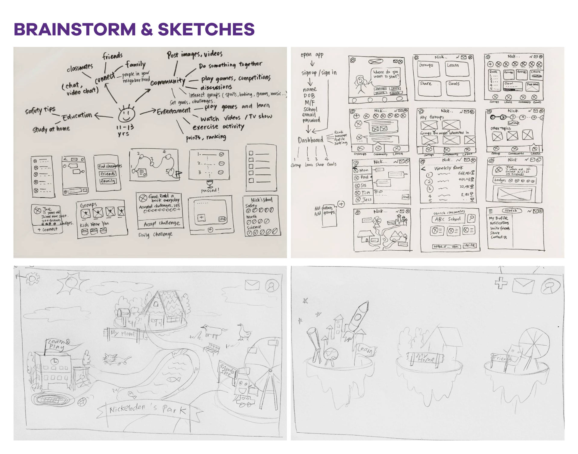
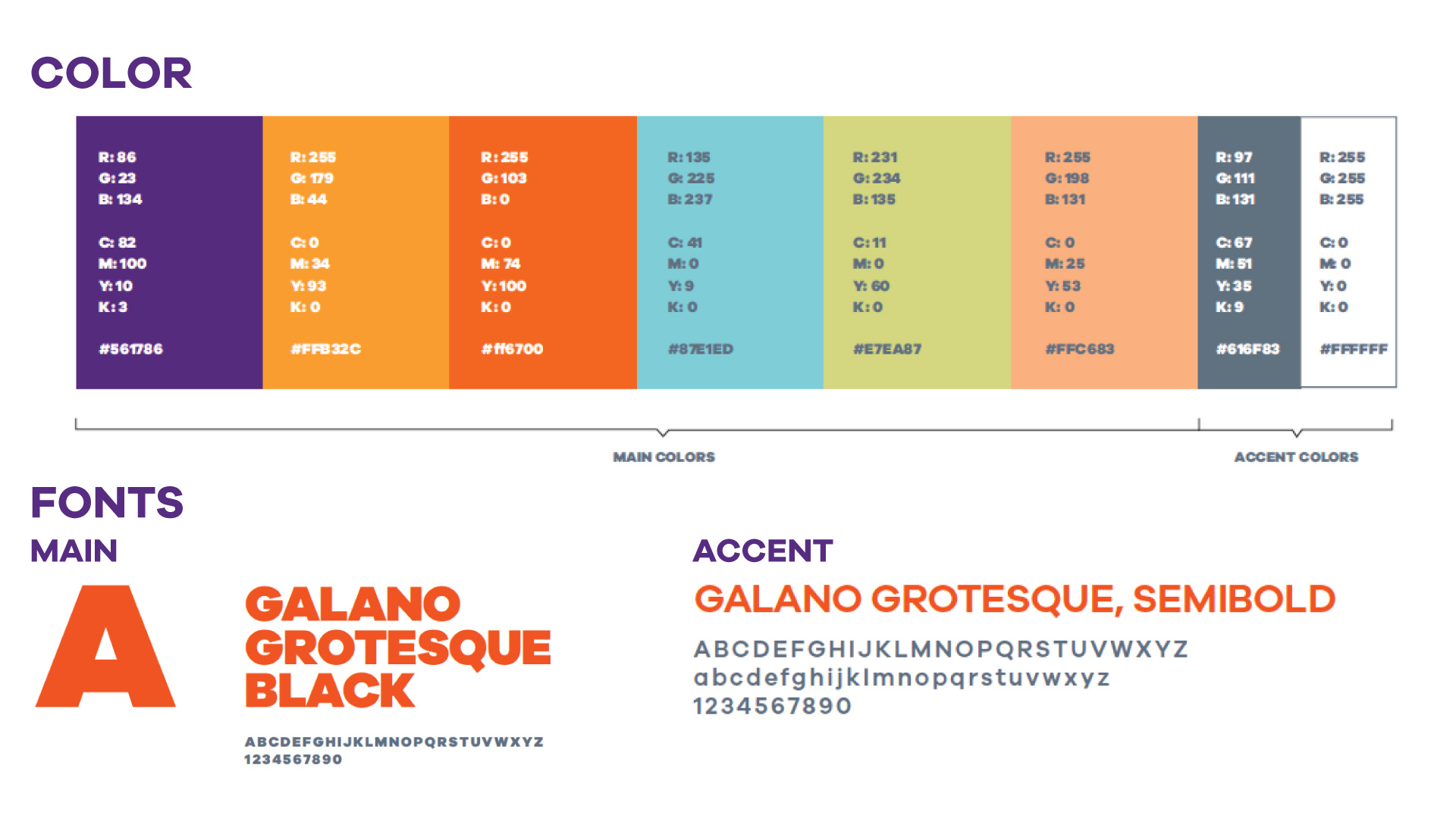
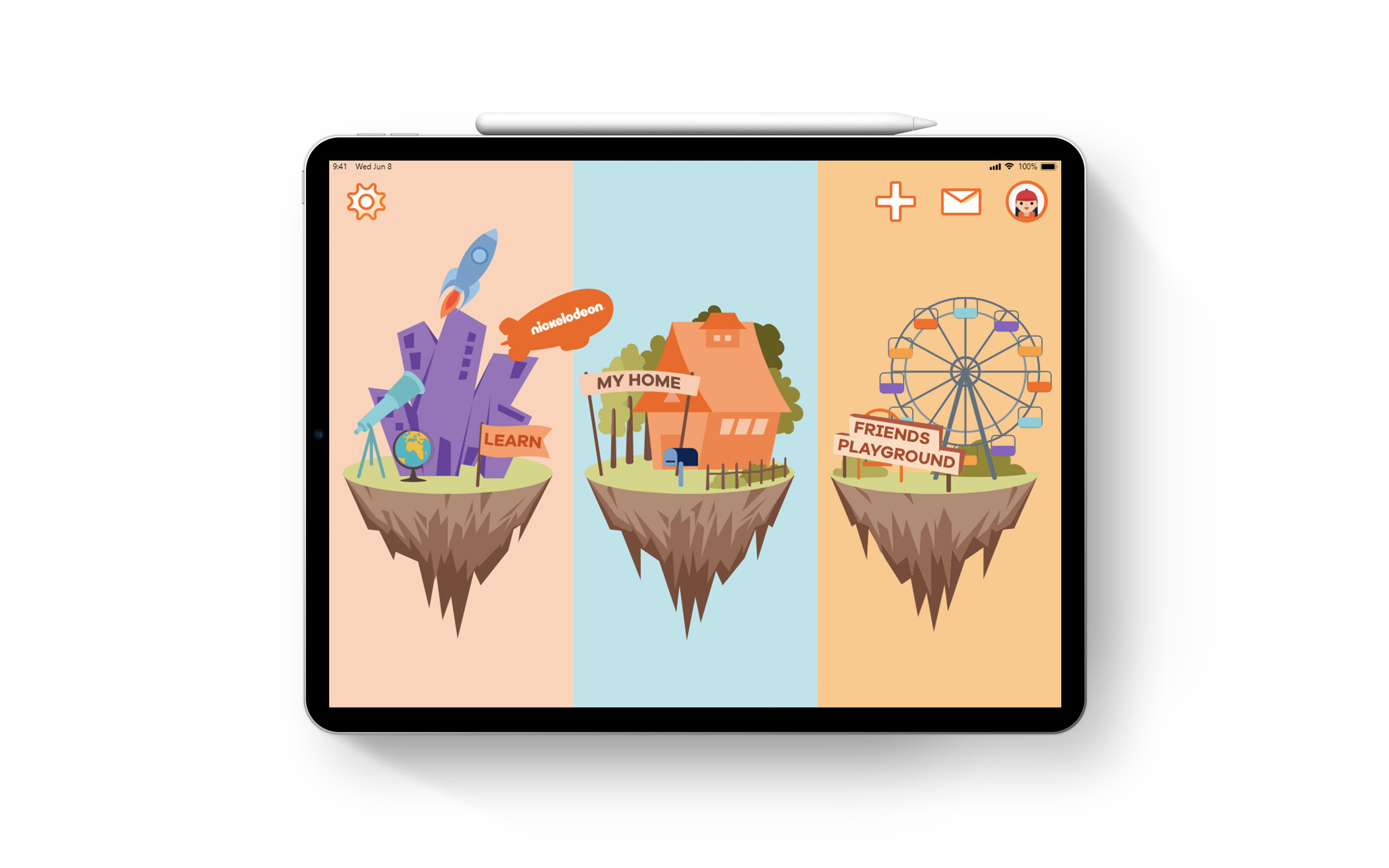
This was a project completed during Nickelodeon + Adobe Creative Jam. The inspiration came from a game we loved to play when we were children. Three floating islands represent three main features of this app: learning and winning badges, showcasing the house, and visiting friends’ houses. The style is consistent with Nickelodeon’s brand style, which is vibrant, and playful. View the prototype here.
Problem
During the viral outbreak, children experienced a sense of disconnection from their friends and a feeling of fear and lonely.
Goals
1. Help kids connect to their classmates, friends, and family.
2. Allow kids to express themselves privately, or within a secure community
3. Encourage kids through a game to learn about safety
4. Educate and empower kids on best practices and good habits to keep the household safe
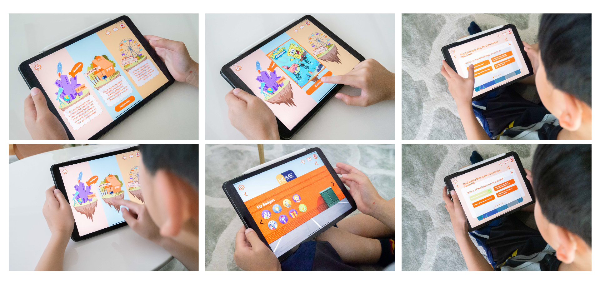
Onboarding Flow
First-time users will receive a brief tour that explains the function of each feature. As a special bonus, kids may receive a surprise every time they open the app.
Feature #1: Learning Island
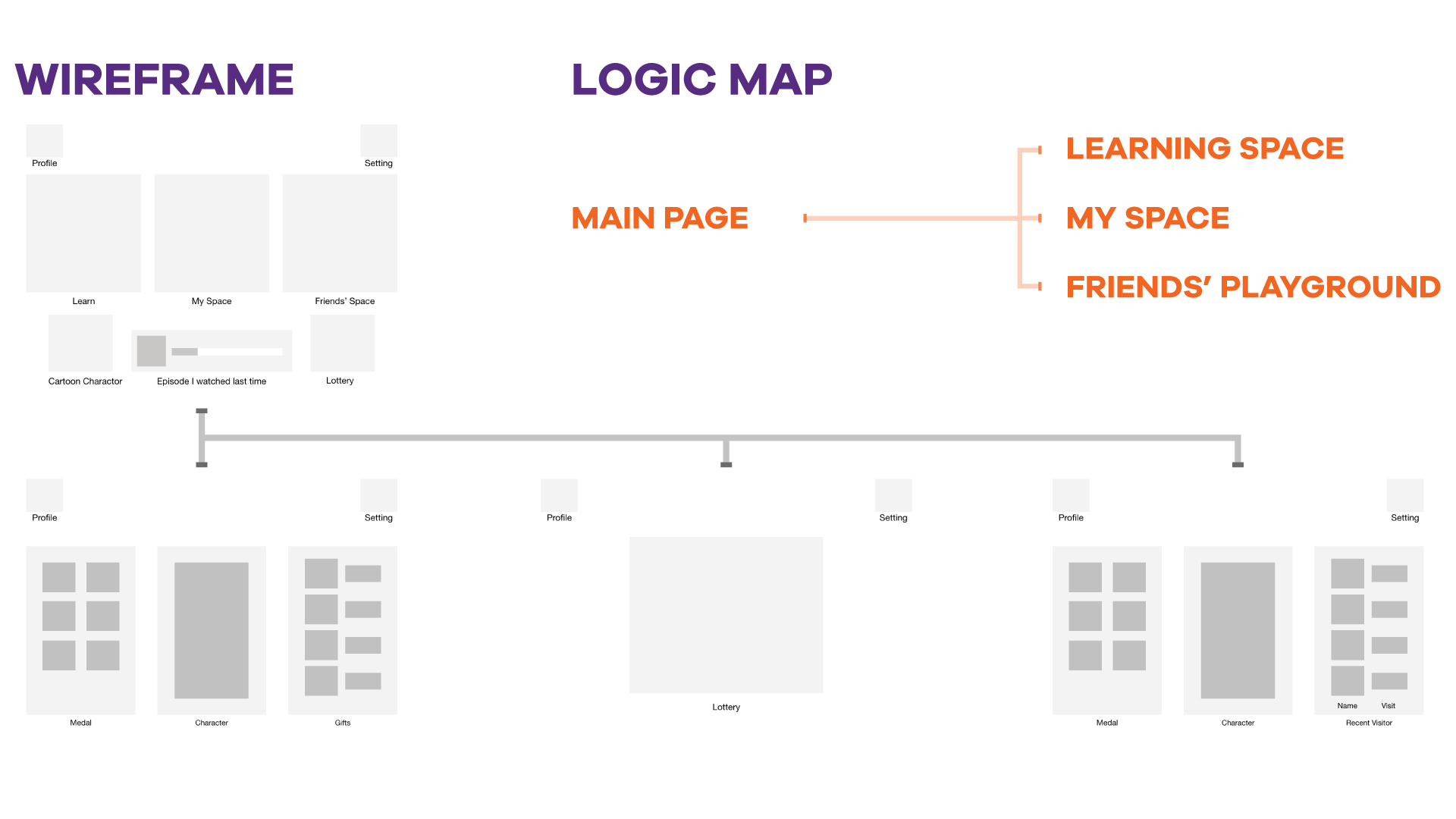
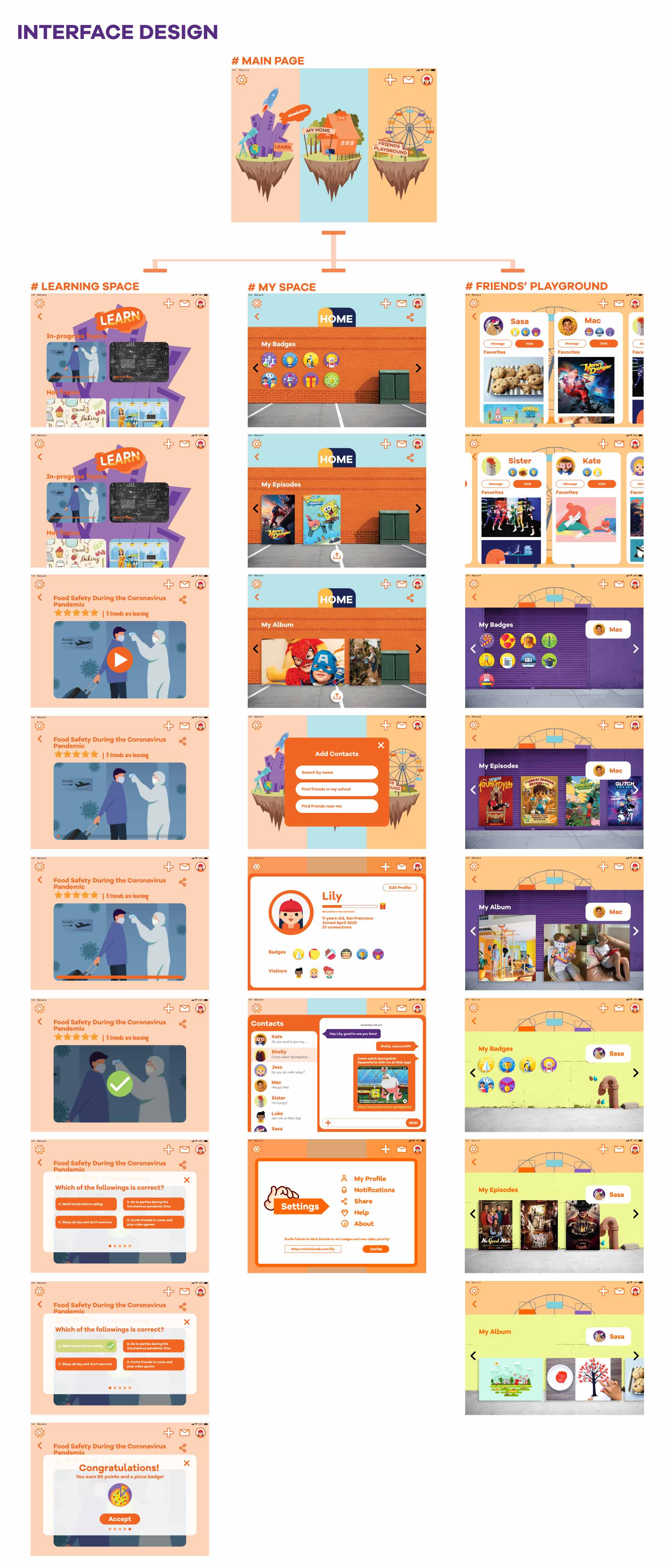
The central feature of this app is Learning Island, where children are encouraged to watch informative videos about staying safe during the pandemic, take quizzes to test their knowledge, and earn badges as a reward for their efforts. These badges will be displayed on their House Island and will be visible to their friends.
Feature #2: Decorating your house
At their home island, users can decorate the interior of their homes by adding images, videos, favorite episodes, and badges.
Feature #3: Visiting friends’ houses
At the friends’ playground, users can find their friends’ homes and check out their updates.

Reflection
Through this 48-hour design challenge, I developed my XD skills and creativity. It was not easy developing this app from brainstorm to prototype in 48 hours. I challenged myself to create illustrations for the app. It was a learning experience to design for kids because we were used to designing for adults. The process was fun when we saw the lively designs that came out. It was so impressive to see how the winning teams approached and solved this challenge. Although our design was not selected as a finalist, we realized the areas of improvement and learned to improve our concept next time. For example, we should narrow the features and focus on the flow of each feature, increase interactions with the users, and think outside the box.
