Team
Yining Qian, Siripat Virushamornphan
Tools
Adobe XD
Timeline
April 24 - May 23 2020
Brief
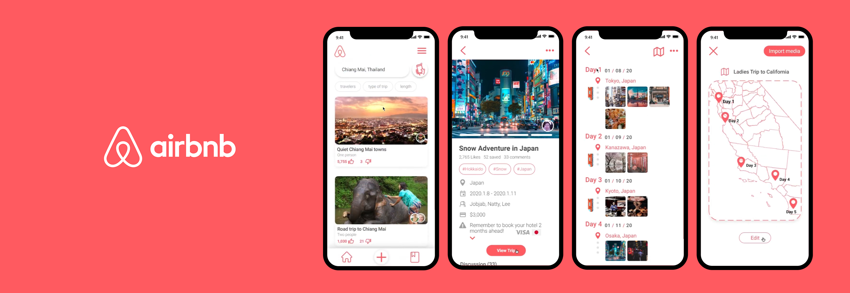
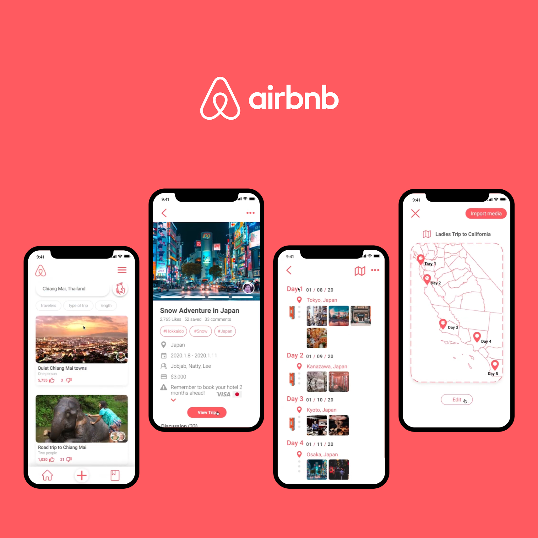
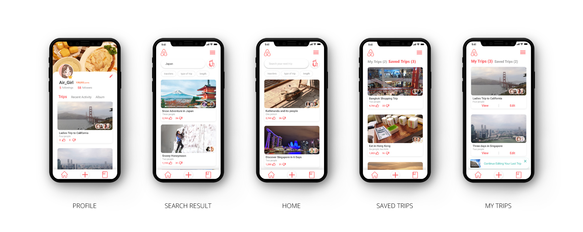
As part of the Airbnb + Adobe Creative Jam, we undertook a project that aimed to create immersive travel stories by combining photos and notes from shared trips. Although the initial version took us 24 hours to complete, we were not satisfied with the design and did not win the competition. My teammates and I were determined to refine our work. Through our efforts, we provided users with a platform to create engaging and captivating stories about the cultures and destinations they have experienced. View the prototype here.
Problem
How might we empower families and groups of friends who travel together with a collaborative way to document, organize, and share their travel experiences and stays to the larger Airbnb community?
Goals
1. Allow people to learn, favorite and save stories, discuss, and safely connect
2. Reflect valuable trip experience and memories in a storytelling way
3. Tell stories about the cultures and destinations
Solution

Research
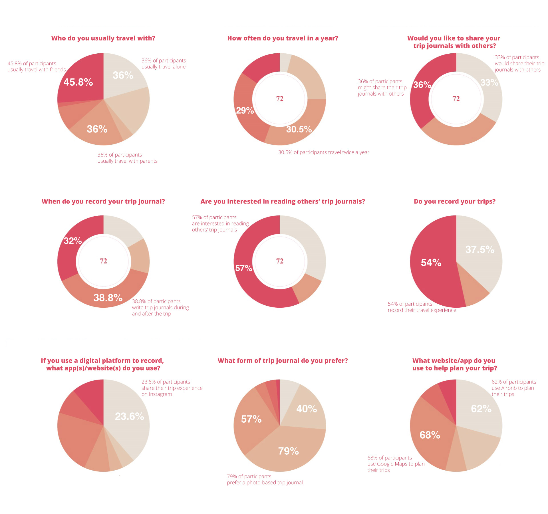
To narrow down our research topic, we initiated a survey to gather information about people’s travel behaviors and preferences. Our survey received 72 responses from participants in the US and China, aged between 16 and 51 years. The results of the survey allowed us to target specific issues related to travel. For instance, we found that while people expressed interest in reading other’s trip journals, the majority of participants were not willing to share their own journals with others.
Insights
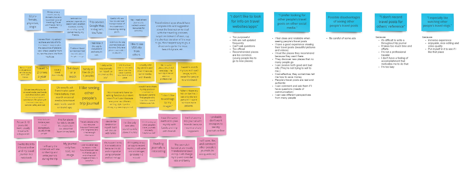
1. Most people record a journal because they want to remember their trips later, they like journaling, or they want to share photos.
2. Not many people want to share their journals with others.
3. “I want to keep all my bookings in one place.”
Opportunities
1. A photo-based journal instead of a text-based journal
2. Connecting the app with popular social media
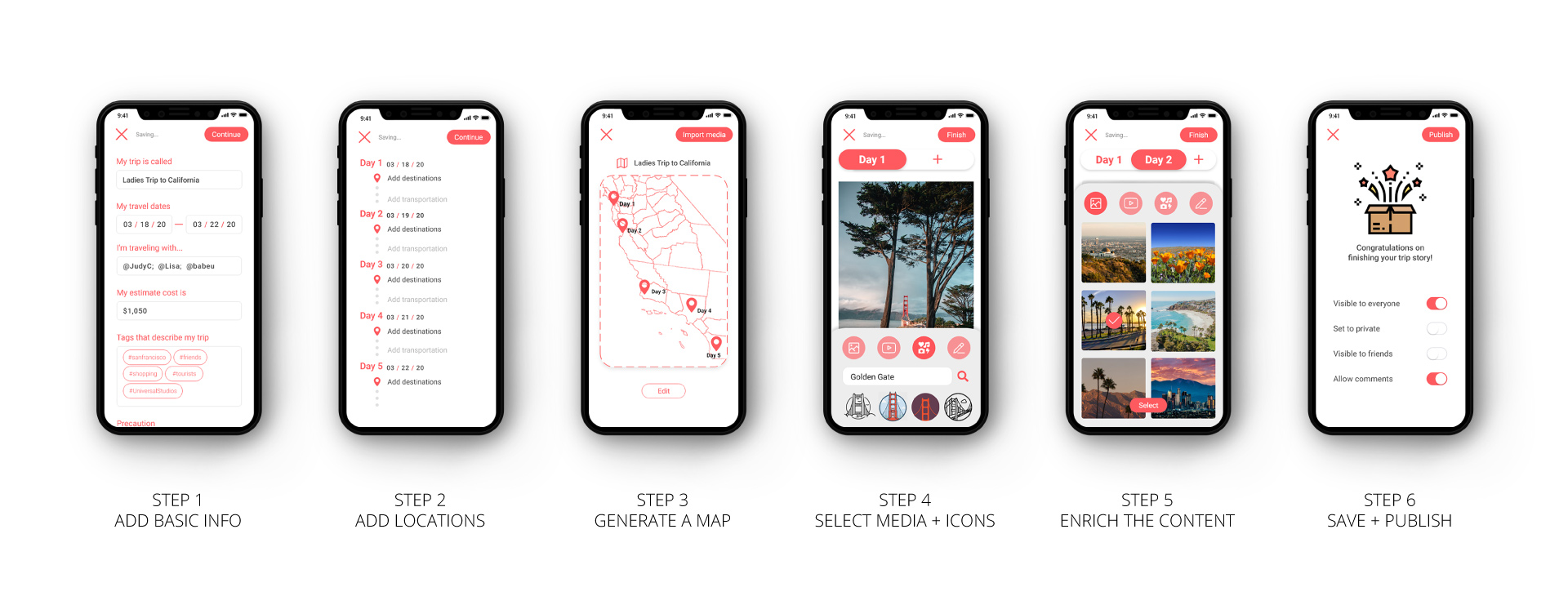
3. Provide the options to set the viewing options to public, private, or visible to friends
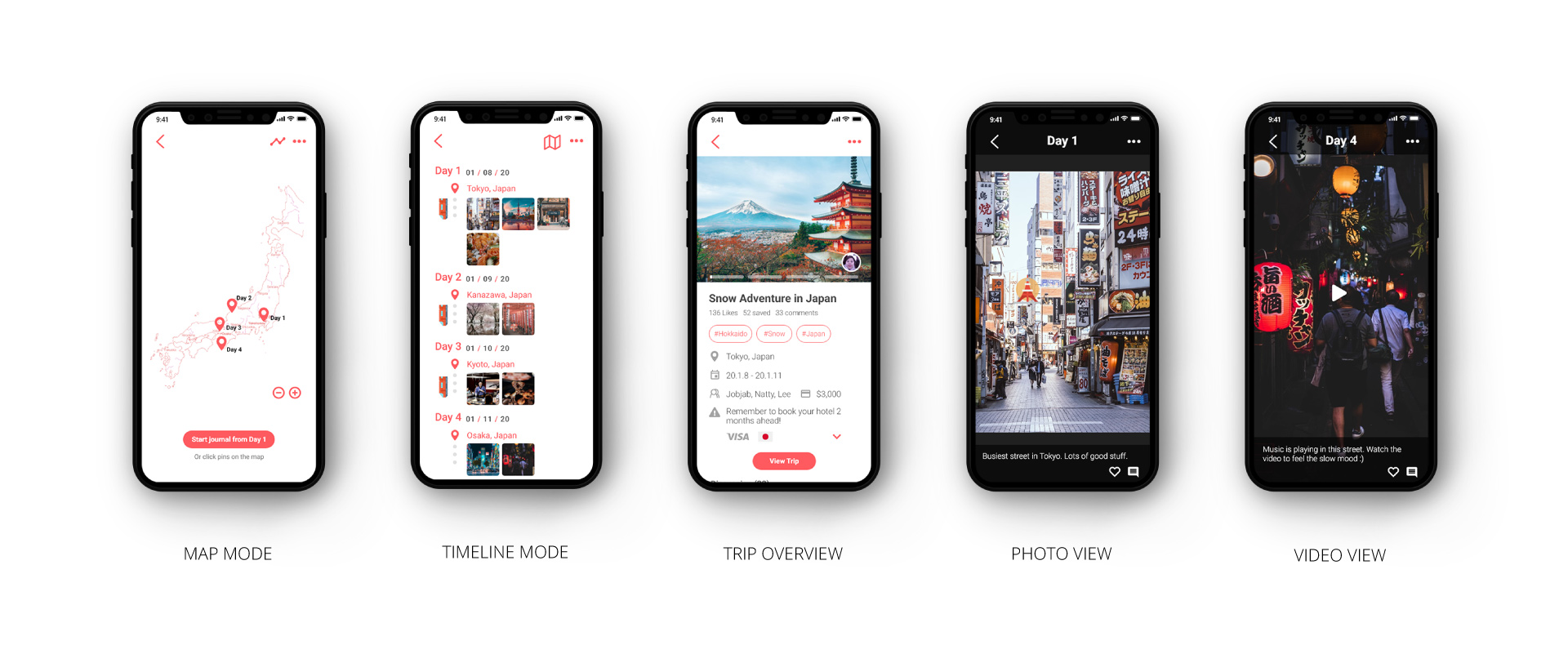
4. A map that shows all the places you have gone to
5. A section to save hotels, restaurants, and recent activities
6. Ratings and recommendations for others
7. Sort images in a single journal based on dates, cities, or categories
8. Filter trip journals based on the number of travelers, type of trip, and length of the trip
Interviews
We interviewed four people. They were two 20-year-old college students who usually travel with friends and family, one 43-year-old mother who usually travels with family, and one 32-year-old physician who usually travels by herself.
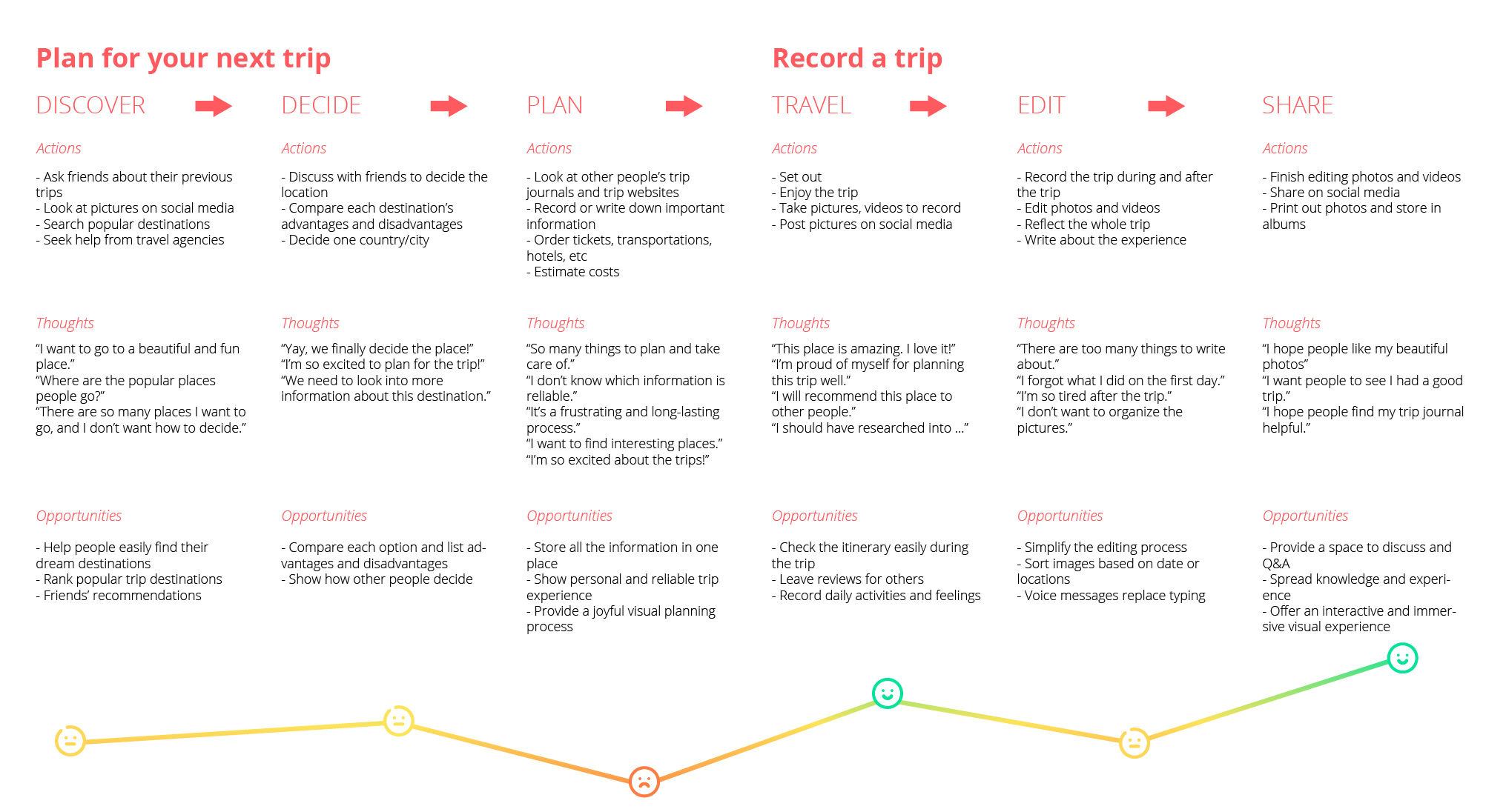
User Journey
Personas
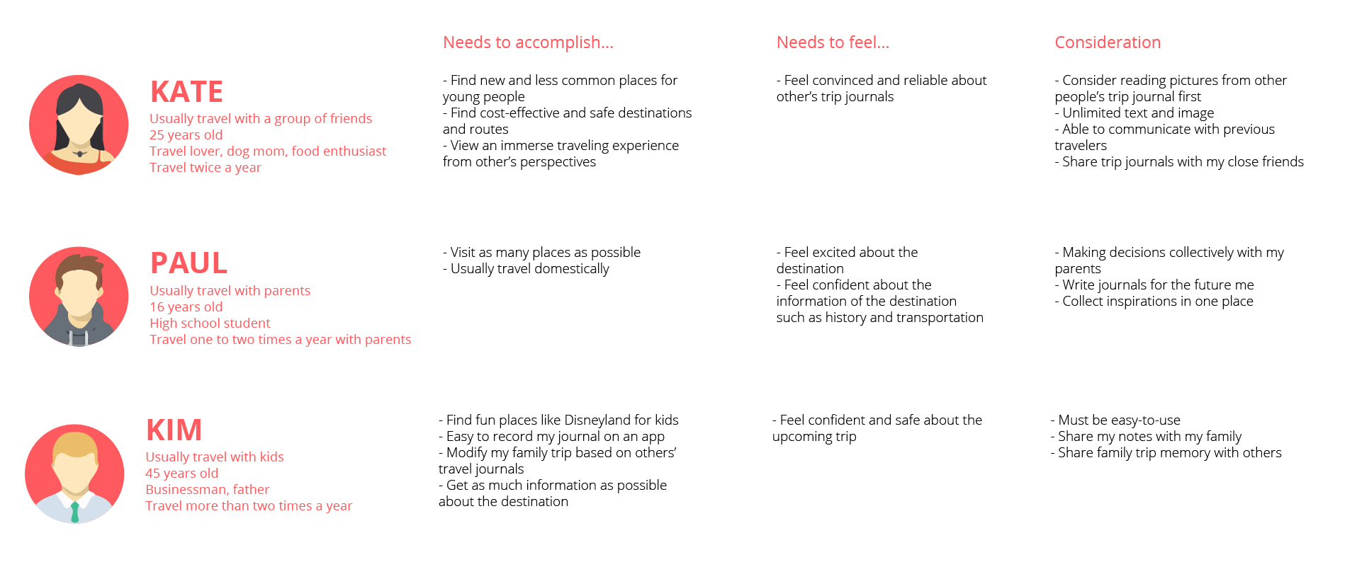
We created three personas based on our interviews. These three types of people represent people who usually travel by themselves, with friends, or with family. We believe their travel experience and behaviors vary depending on the people they travel with.
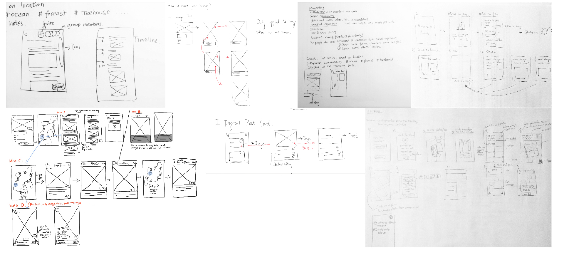
Ideation
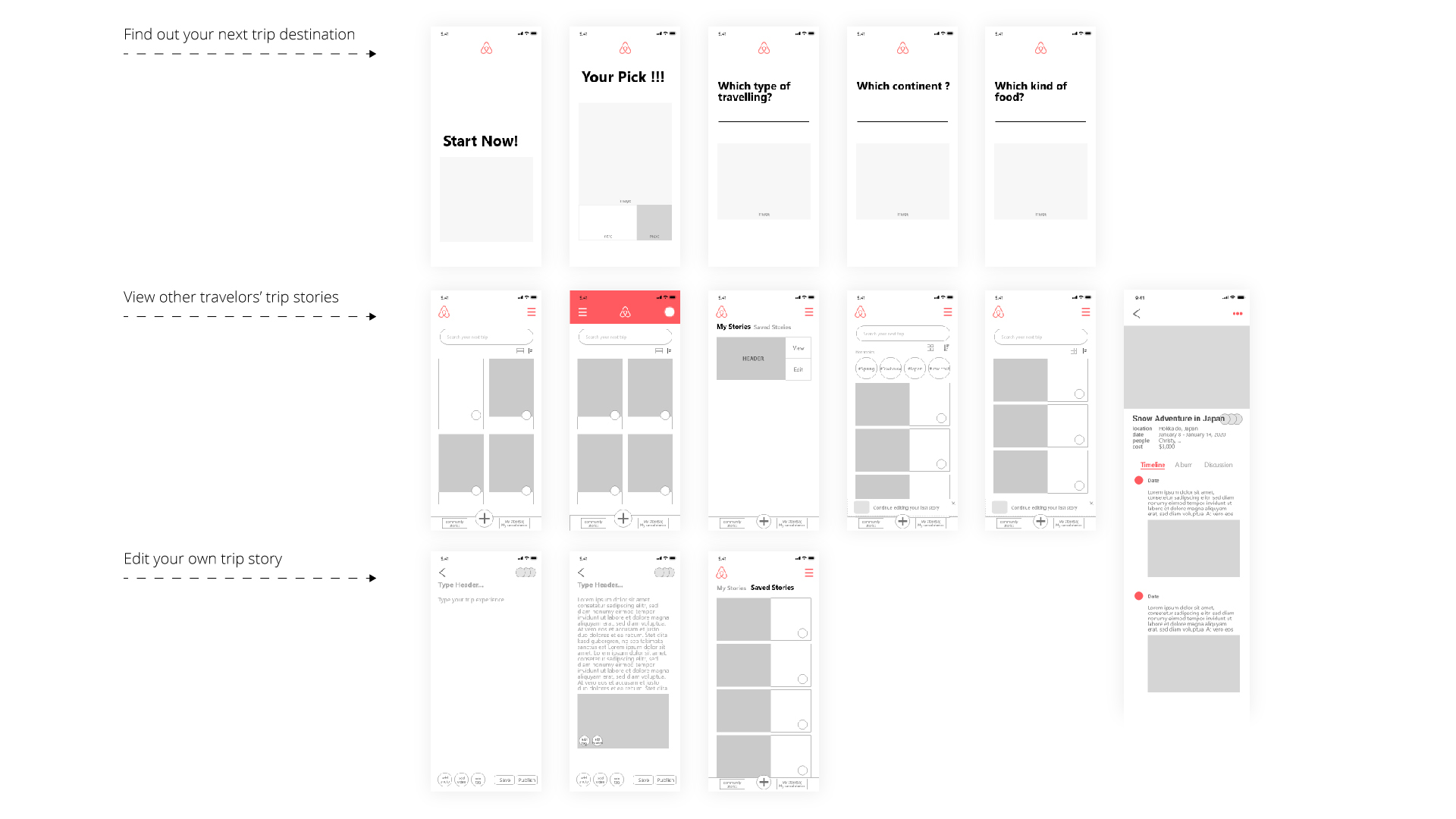
User Flow

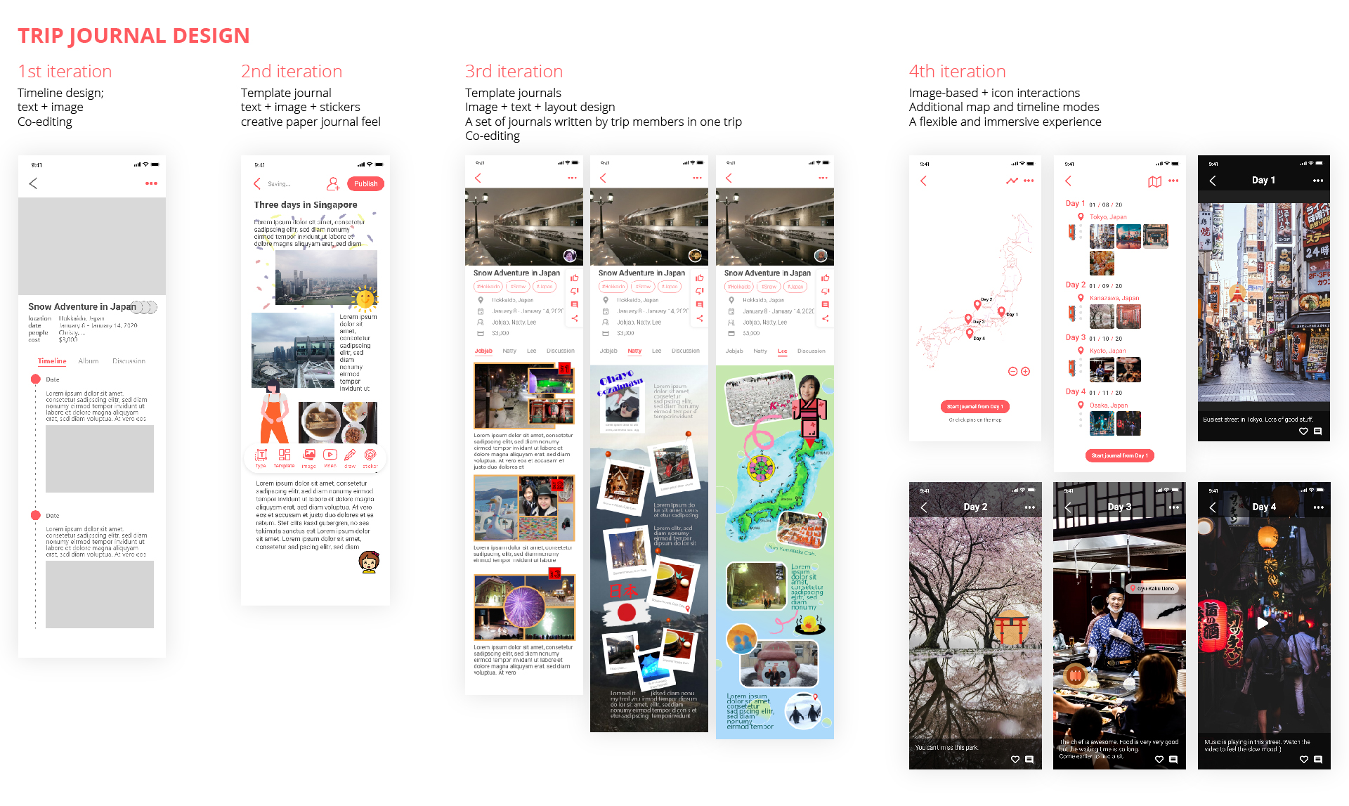
Prototype
User Testing
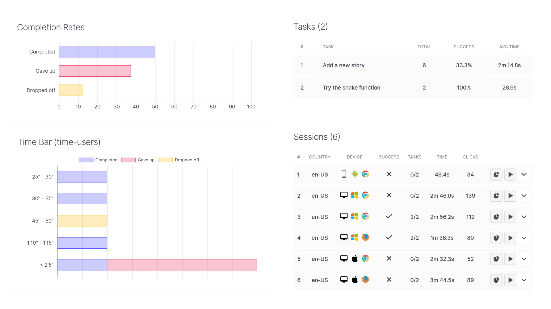
We tested our prototype using Useberry. The feedback we got from the testing helped us to improve our designs. For example, a user mentioned that she couldn’t find information about transportation and safety. Although she likes the experience of seeing big images and interacting with icons, she can’t see a big picture of the trip. Therefore, we went back to our designs and added three features. We put in a section to add notes about recommendations, visas, weather, etc. By choosing map mode or timeline mode, users can see an overview of the trip. Users also can indicate their transportation choices during the trip while editing locations.
Reflection
It was my first time conducting user testings. I gained valuable insights into the usability of our album icon design. It became evident that some users found it difficult to understand. This was particularly true for older users who are not as tech-savvy. Through user testing, I was able to understand the issues from the users’ point of view and improve the design.
